BRAND SYSTEMS · 2024
GW Limiter: The Art of Restraint
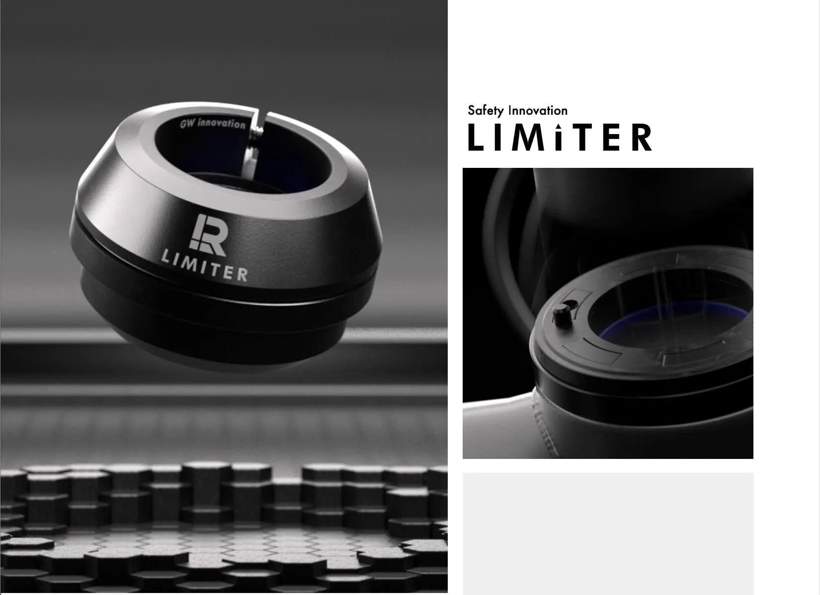
A futuristic identity that fits the innovative component.
The problem
A patent protects an idea — it doesn’t introduce it.
A patent secured. A reputation — still at zero.
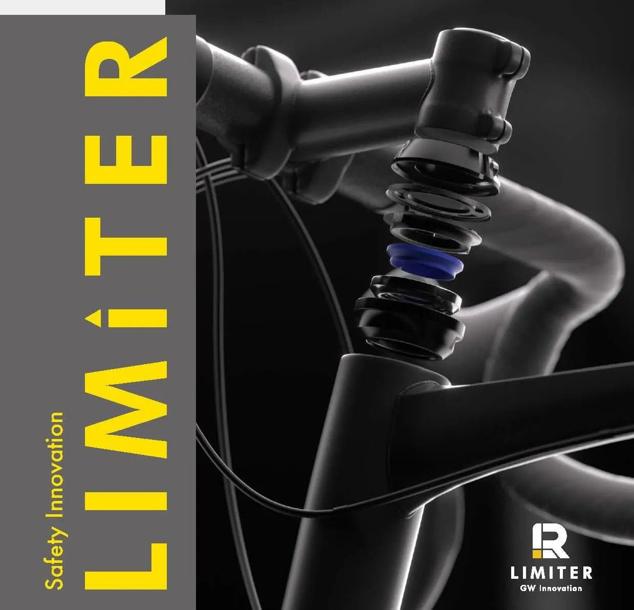
Innovation in cycling usually announces itself: new frames, new groupsets, big components with big budgets behind them. But some of the most meaningful innovations arrive on the smallest parts. GW Manufacturing, a global bicycle component maker, developed a patented, built-in steering limiter with a range of engineered features, designed to solve a serious problem — steering overturn, which often results in accidents. The engineering was solved and the patent secured, but the component had no name worth remembering and no presence at all. Two challenges stacked on top of each other: educate a market on a problem most riders didn’t know they had, and build a brand for a single component — in an industry where parts are spec’d and photographed, never branded.
The goal
A brand for a component — not a company.
Not a company rebrand. A brand for one component.
An unusual brief, and a precise one: create a real, ownable brand for the component itself, and use it to garner interest across the industry — riders, brands, and partners who had never heard of a steering limiter before.
The explainer video that turned an abstract promise into something riders could see
Our insight
Prevention is invisible, so the brand itself had to do the explaining.
For a part this small, the identity had to be the loudest thing about it.
A safety component that works is one you never notice — which is precisely why safety innovations struggle to earn attention. Riders don’t go looking for a solution to a problem they’ve never experienced by name. So if the identity could demonstrate what the product does — not just decorate it — then every glance at the logo, the packaging, or the video would become a small lesson in what a steering limiter is and why it matters.
The concept
A logo that performs the very job of the product itself.
Name, function, and identity — one self-explaining system.
The component’s entire purpose is to restrict the handlebar’s steering range, left and right — so we made the brand perform the same gesture. The logo merges the letters L and R, drawn together and held within an elegantly restricted form: the mark literally demonstrates the product. Once someone learns what the logo means, they understand the product — and every future glance reinforces it. Two further decisions completed the concept: a futuristic visual language across the explainer video and every touchpoint, fitting for advanced, patented engineering; and a sub-brand structure under Glory Wheel — the component carries its own name and identity while visually descending from its mother company, borrowing manufacturing credibility while accumulating brand equity of its own.
The scope
- 01Brand System
- 02Product Render
- 03Video Content
- 04Brand Assets
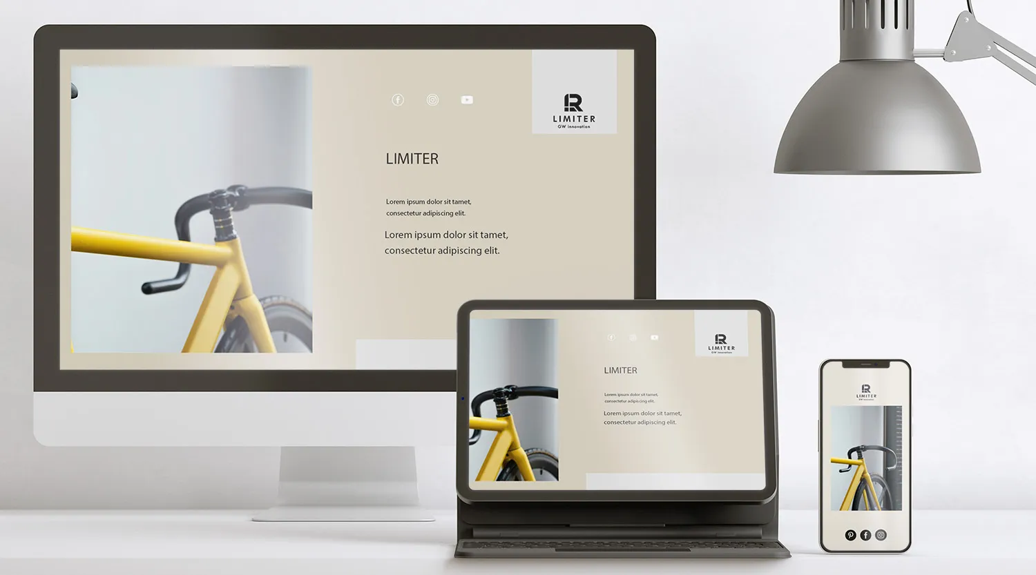
- 05Web Dev & SEO
The explainer video that turned an abstract promise into something riders could see
“Mocca delivered a design that is as innovative as our product — making it even more unique.”
Eddie Chi — Product Manager, GW Manufacturing